Smart Shopper
A grocery comparison app for newly arrived expats in the Netherlands, designed to find familiar products, compare prices, and navigate Dutch supermarkets without the friction.
Every grocery comparison app in the Netherlands was built for Dutch speakers. None of them worked for this user.
Internal HR research at a Dutch company showed that newly arrived expats were struggling with a very specific everyday problem: finding where to shop. Not just on price, but for familiar products from home, in stores they could actually reach without a car.
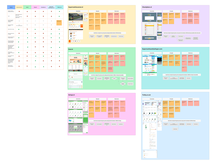
Eight grocery comparison apps already existed on the market. All of them were Dutch-only, browser-based, and missing the features that interviews showed expats actually needed: English support, a store locator, coverage of international supermarkets, a proper mobile experience. None had all four.
"Most participants were already looking up prices on store websites before leaving the house. It worked, but it was slow and spread across four or five different sites."
, from interview notesShipped to production. Validated with 50 users.
Start with the person, not the product gap
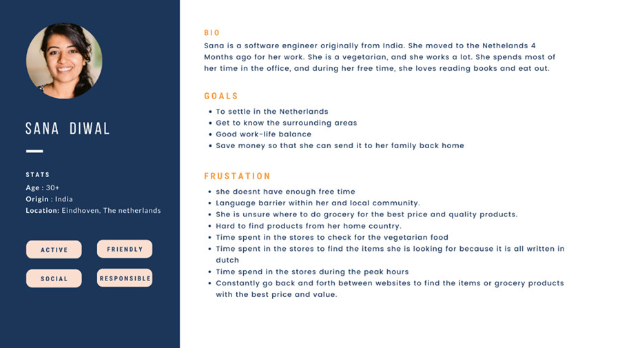
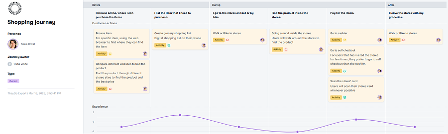
I interviewed 10 newly arrived expats to understand how they were actually navigating grocery shopping in a new country. Not what they wished existed, but what they were already doing to cope.
That research, combined with a competitive analysis of all eight existing grocery apps in the Netherlands, confirmed the gap was real and not already filled. The existing apps were not just incomplete. They were designed for a completely different user.
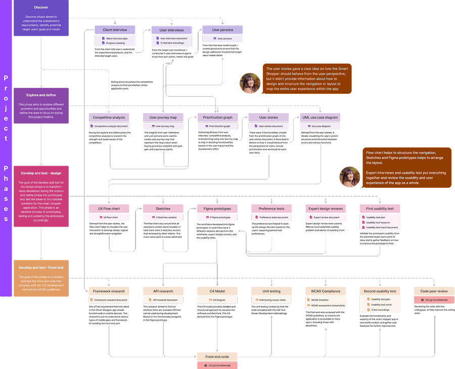
From there: user persona, user journey, UX flow chart, several rounds of sketches and Figma prototypes, usability testing with five participants, WCAG compliance checking, and a full UX evaluation using the UX Honeycomb framework.
I also built the front-end in Ionic Angular alongside an in-house back-end developer. Design to production, start to finish.
Ten interviews to understand what was actually going wrong
I recruited 10 newly arrived expats and ran structured interviews focused on their grocery shopping habits. I wanted to understand the workarounds people had already built into their routines, not just the problems they could name.
Four things came up consistently across almost everyone:
- Language barriers slowed everything down. Translating ingredient lists, discount types, and product names on the spot added real time to every trip.
- Transport was a hard constraint. Most participants did not have a car, were not confident cycling, and found public transport expensive for a grocery run. Distance mattered more than price for some of them.
- Price comparison required effort. Several people looked up prices across multiple store websites before leaving home. It worked, but it was slow and spread across four or five different sites.
- Store layouts felt wrong. Categorizations that made sense at home did not match Dutch supermarkets, which made finding products take longer than expected.
Eight apps in the market. None of them built for this user.
As of early 2023, eight grocery comparison apps existed in the Netherlands, three of which were still under development. I reviewed all of them against what the interviews had surfaced.
The same gaps showed up across the board:
- No English. All apps were Dutch-only, which made them unusable for the target group.
- No mobile app. All browser-based, with interfaces not designed for a phone screen.
- No store locator. Finding the nearest store was not a feature any of them offered.
- No international stores. None included Asian, Polish, Turkish, or other specialist supermarkets that expats used regularly.
- No saved search history. Every session started from scratch.
This confirmed the opportunity was real. The gap existed not because this problem was hard to solve technically, but because no one had designed for this user at all.
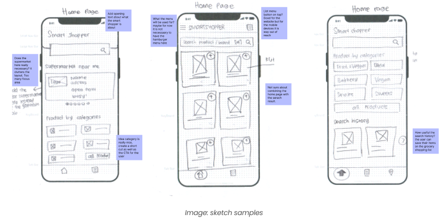
UX flow chart first, then sketches, then prototype rounds
Before drawing any screens, I mapped the full navigation structure using a UX flow chart. The app needed to be simple enough for a first-time user to navigate without instruction, especially for someone unfamiliar with Dutch app conventions. That is harder to design for than it sounds when you are working across multiple languages and user contexts.
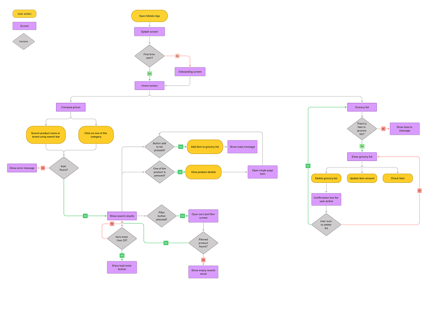
From the flow chart I moved into sketches, then Figma prototypes. Several rounds, testing and iterating between each one. The goal was to resolve all open design questions before development started, so nothing needed rethinking halfway through a build.
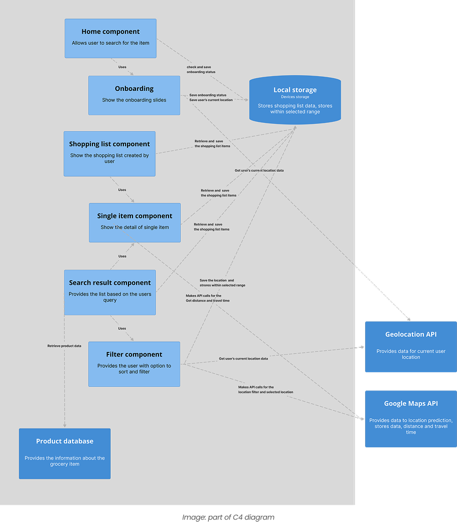
Front-end built in Ionic Angular, connected to a custom Shopping Scraper API
I built the front-end using Ionic Angular and Bootstrap, working alongside an in-house back-end developer who built the Shopping Scraper API and the database. Being responsible for the front-end myself meant there was no handoff gap. Every design decision landed in code exactly as intended, and anything that looked good in Figma but was awkward to build got caught early enough to fix.
A few interactions got simplified during the build. The simpler version usually worked better for users anyway.
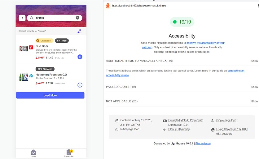
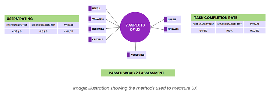
Usability testing with five participants, survey with 45, WCAG checked throughout
I ran usability testing with five participants across multiple rounds and followed up with a survey of 45 users after launch. To structure the evaluation I used Peter Morville's UX Honeycomb, which breaks experience into seven dimensions: useful, usable, findable, credible, desirable, accessible, and valuable.
High task completion showed the app was usable and findable. The 3.9 out of 5 usefulness rating confirmed users found real value in it. Positive feedback on look and feel confirmed desirability. Lighthouse and the WCAG checklist confirmed accessibility. Not every dimension scored equally, but the overall picture held up well.
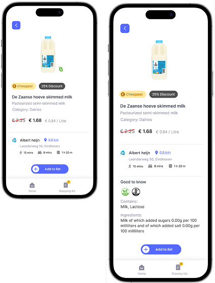
Three features that addressed the core problems directly
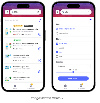
1. Comparing groceries, the easy way
The main screen lets users search for a product and compare prices across multiple Dutch supermarkets at once. Each user can prioritize differently: best deal, nearest store, or a combination of both. Based on usability testing with five participants, the app cut average grocery comparison time by 40%, from three minutes down to 1.8 minutes, compared to checking individual store websites.
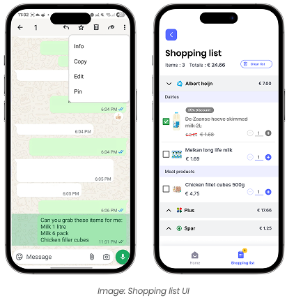
2. Next-level shopping list
Users can paste their grocery list directly into the app. It automatically categorizes items by store aisle, based on the user's previously visited stores. No more navigating a Dutch supermarket looking for something that would be in a completely different section than you expect. The feature received an average rating of 4 out of 5 from users.
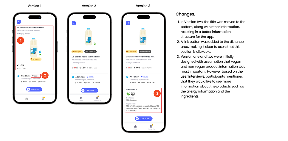
3. Product detail with "Good to Know"
The product detail page includes a "Good to Know" section covering ingredients, allergens, and other information users previously had to look up and translate separately. Three out of five test participants reported spending significantly less time translating ingredient lists. It was especially useful when searching for products that fit specific dietary needs.
What I would do differently
The app shipped and the metrics held up. There are still two things I would approach differently if I were starting again.
What this project taught me
A clear gap in the market is not enough on its own. The eight existing apps left a real opening, but filling it well meant understanding why those gaps existed in the first place. Some were market decisions. Some were technical. Some were assumptions baked into the design from the start. That distinction matters when you are deciding where to invest your research time.
Being responsible for both design and front-end also changed how I approached the UX work. Knowing I would be building it made me more careful about decisions that would be hard to implement well. That constraint ended up improving some of the solutions. Things that looked elegant in Figma got simplified once I started building them, and the simpler version almost always worked better for users.
The part I would still fix is the onboarding. Getting users to set up their preferred stores and dietary preferences takes more effort than it should. The whole app depends on that setup being done well, and right now it asks too much upfront.
Improvements worth building
- Notifications when a product in your shopping list goes on discount
- Combining grocery lists from multiple stores into one trip
- Barcode scanning to look up and compare products in-store
- Filtering by product quantity for accurate price-per-unit comparisons
- Saving store loyalty cards so users do not need to switch apps at checkout
- Online shopping integration for stores that support it
Next case study
Moodlet, Stress tracker →