Moodlet
A lightweight stress and mood tracker that helps people spot emotional patterns, before they become a problem.
Most people only notice stress once it's already too late
I designed Moodlet as a personal project born from a simple frustration: I'd had weeks where I felt fine right up until I really didn't. The stress had been building, but I had no visibility into the pattern until it was already a problem.
Existing mood trackers were either too clinical (PHQ-9 style forms that felt like assessments, not tools) or too fluffy (sticker journals with no insight layer). I wanted something that sat in between: quick to log, but smart enough to surface patterns.
Design goal: Make the daily check-in so frictionless that users actually do it, and make the weekly overview meaningful enough that they want to.
"Apps that asked too much every day. That was the top reason users abandoned mood tracking, not lack of motivation, but too much friction."
What makes Moodlet different
Three deliberate design choices defined the product:
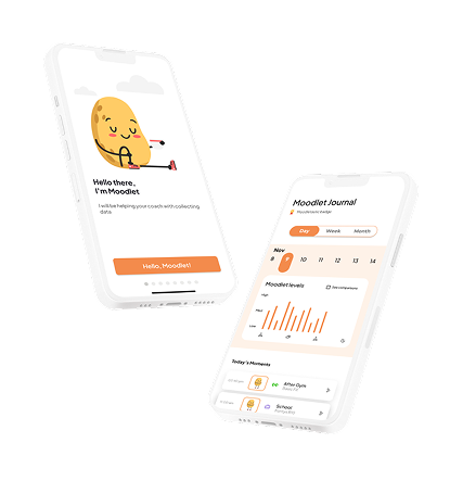
- 30-second check-in: One emoji selector, one optional note, one contextual tag. No forms, no friction.
- Pattern view, not data view: The weekly summary shows emotional arcs, not bar charts full of numbers users have to interpret themselves.
- Trigger tagging: Users can tag what they were doing (work, social, exercise, rest), making the pattern view actually actionable.
The problem with existing mood trackers
I started this project after noticing a pattern in myself: I'd go through weeks on autopilot and only realise I was stressed or depleted after the fact. I looked for an app to help me track this, and found a landscape that was either medically-oriented (formal, clinical, assessment-heavy) or overly decorative (cute but shallow).
Neither approach surfaced patterns. Neither was designed around the insight layer, the "why am I feeling this?" question that makes tracking valuable. So I designed my own.
Talking to people who'd tried, and abandoned, mood tracking
I interviewed 6 people who had previously used a mood or wellbeing tracking app. The goal wasn't to validate my concept, it was to understand why existing tools failed to stick.
What worked for them
- Quick, low-effort entry moments
- Feeling like the data "meant something"
- Visual overviews rather than raw numbers
- Reminders that didn't feel like nagging
Why they stopped
- Logging felt like homework, not a habit
- Charts were hard to interpret without context
- No connection between mood and triggers
- Apps that asked too much every day
Insight: Nobody stopped because they didn't care about their wellbeing. They stopped because the tools made caring about it feel like effort. The design challenge was reducing friction while increasing meaning.
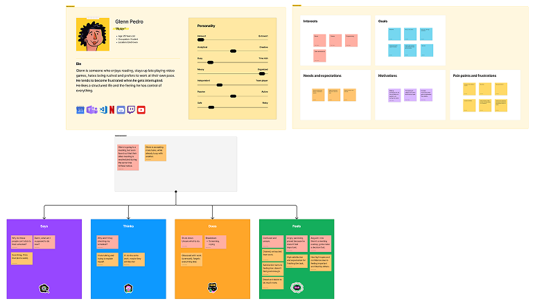
Persona & empathy map
The insight that grounded the whole product: the user really dislikes changing routines, prefers to do things at his own pace, and doesn't like complicated tasks or applications. Every design decision had to respect that.
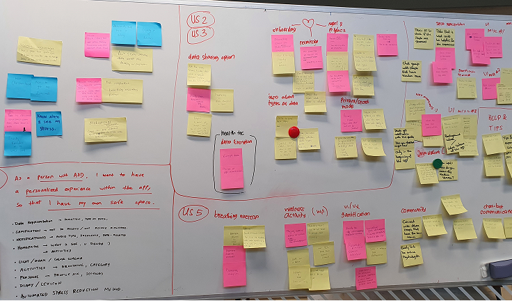
User stories & requirements
I translated interview themes into user stories to keep the brief honest about what users actually wanted, not what would be fun to design.
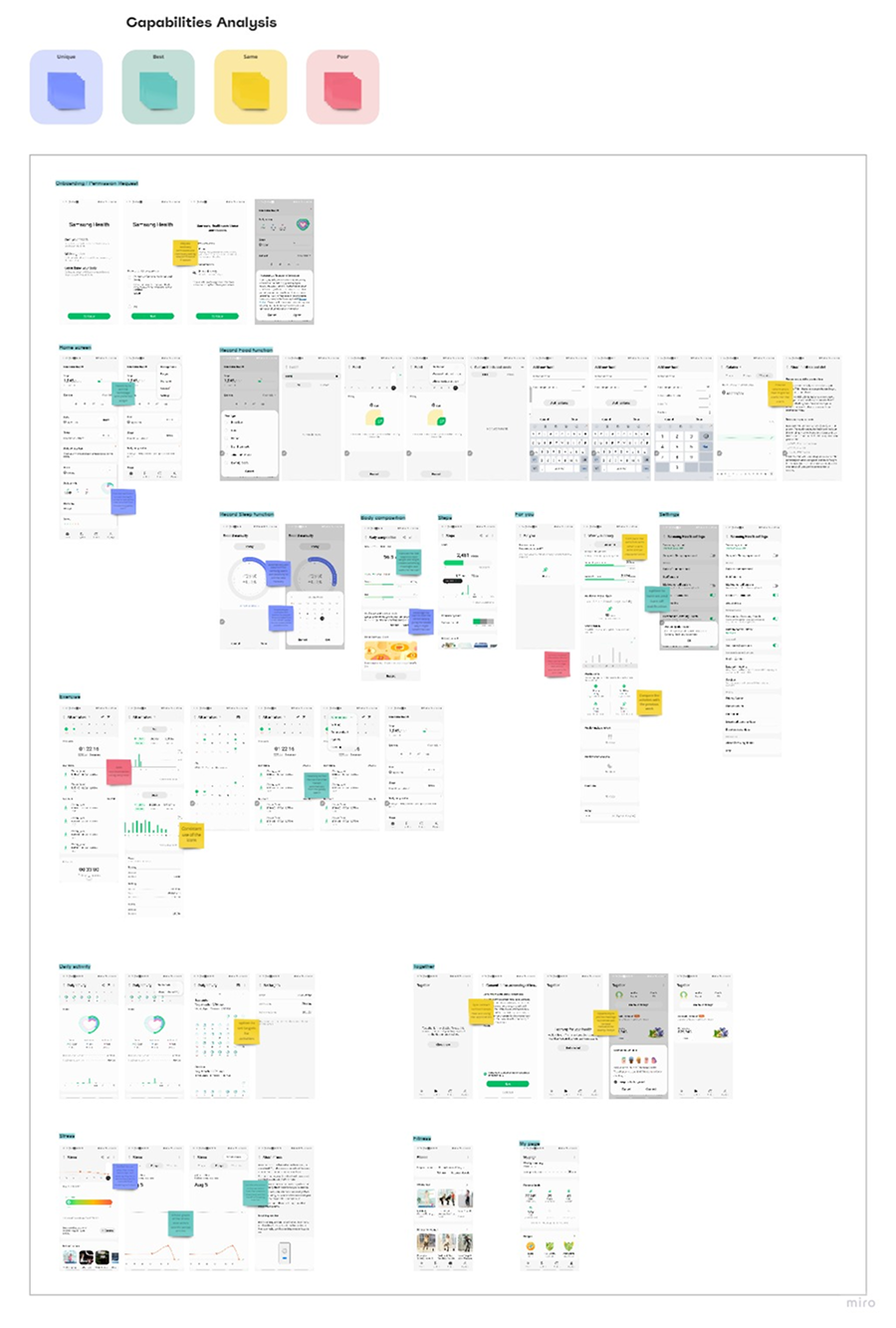
Competitor analysis
I looked at direct competitors (Samsung Health, Apple Health) and indirect ones (activity trackers like Productive) to map good, best, and common practices, and the gaps no one was filling.
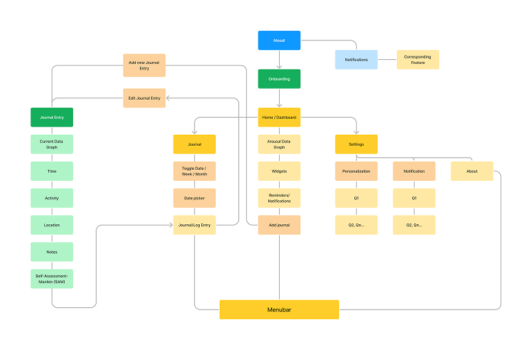
From insight to tested prototype
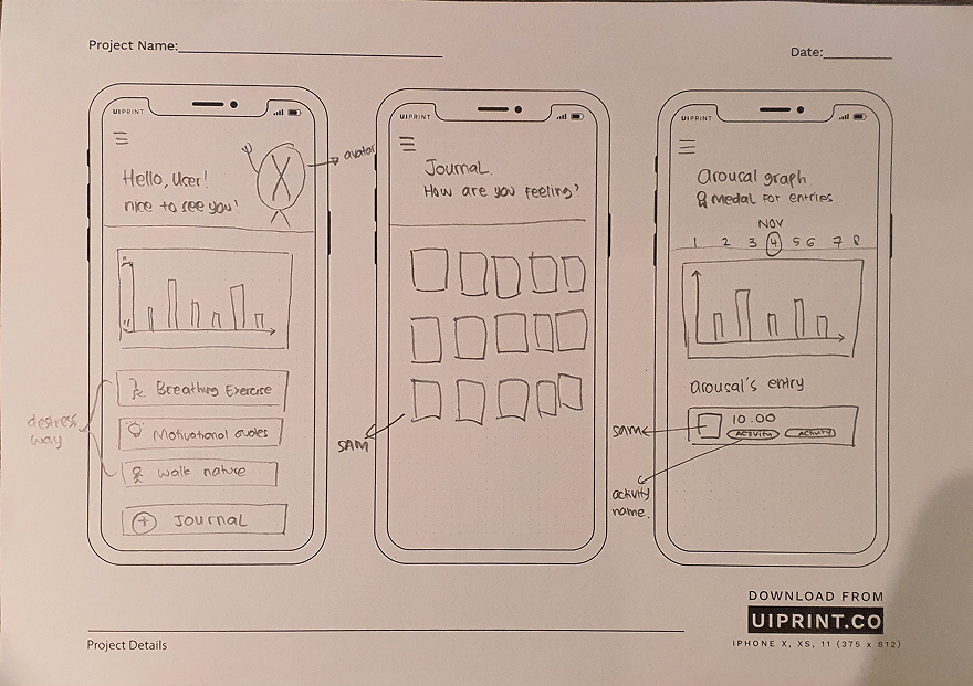
Sketches
Discussing rough sketches with colleagues surfaced challenges early, before any pixel got polished.
Figma prototype
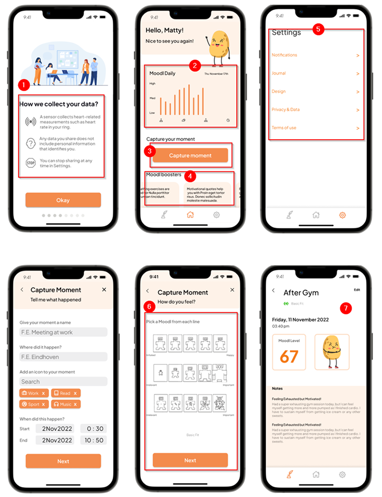
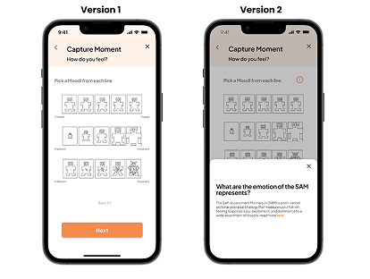
The high-fidelity prototype turned the IA and sketches into a testable flow: transparent onboarding, a simple-but-readable graph, the “Capture moment” button, Moodlet boosters for advice, settings tailored to user needs, and SAM-based emotion logging.
Three things I'm most proud of
1. The 30-second rule
Every screen in the check-in flow is held to a strict time constraint: the full daily log must be completable in under 30 seconds. This meant cutting features I liked, freetext notes became optional and hidden behind a "+" tap, not a default field. The constraint made every design decision clearer.
2. Trigger tags, not mood categories
Most apps ask you to categorise your mood (happy, sad, anxious). Moodlet asks what you were doing, not how you felt in the abstract. The emotional insight comes from connecting the mood to context over time, not from labelling it in isolation.
3. Patterns, not data
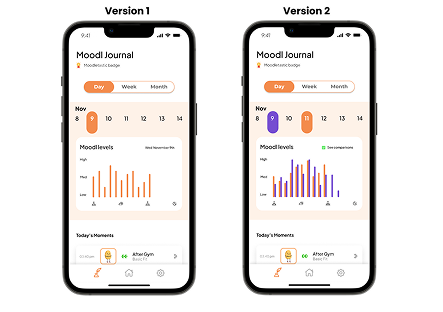
The weekly view renders mood as an arc rather than a data chart. A dip midweek, a high on Friday, you see the shape of the week, not a spreadsheet. Participants in testing described it as "feeling like my week", which was exactly the goal.
Iterations from user testing
Two changes came directly out of round 2: a comparison chart for stacking multiple days against each other, and a cleaner SAM (Self-Assessment Manikin) treatment with the labels removed and an info layer added.
Testing showed the core experience landed
Things I argued about with myself at 11pm
When it's a solo project, there's no dev team to blame and no stakeholder to negotiate with. It's just you versus your own bad ideas. Turns out that's a surprisingly heated argument.
What I'd do differently
The biggest limitation of this project was recruiting. All 6 interview participants were people in my network, which introduced selection bias. A more rigorous version would have recruited across age groups and included people with diagnosed mental health conditions to ensure the app's gentleness and accessibility were truly appropriate.
The insight layer is also where I'd invest more time. The arc/wave view works well for a week, but I haven't solved the month view, or the "how do I act on this" layer that follows pattern recognition. That's the real value, and this prototype stops one step short of it.
This was also the first project where I took accessibility seriously from day one, not as a compliance checklist, but as a design constraint. It made the UI better across the board, not just for users with disabilities.
Next case study
Peduli Lindungi, COVID check-in app →