Context: This was a university design brief completed in 2022 during the COVID-19 pandemic. Peduli Lindungi was Indonesia's national contact tracing and health check-in app, mandatory for entering public spaces across the country.
Peduli Lindungi
Redesigning the check-in experience for foreign tourists in Indonesia, where language barriers and a slow verification process were keeping people out of public spaces.
A mandatory government app with no English support, in a country visited by millions of foreign tourists every year.
During Indonesia's COVID-19 response, Peduli Lindungi was required for entering malls, restaurants, offices, and public transport. No app, no entry. For Indonesian citizens this was already a friction point. For foreign tourists it was genuinely difficult: the app was Indonesian-only, the check-in process required vaccine verification that could take one to three days to approve, and security staff at entrances were not equipped to help non-Indonesian speakers through it.
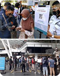
I visited 10 Indonesian malls in July 2022 to observe the problem in the field. Long queues at entry points, tourists held back by rejected check-ins, security staff manually registering visitors one by one. The same failure pattern, repeated across every location.
"The language barrier further complicated matters, with little assistance available from security personnel. These issues not only caused frustration but also restricted tourists' access to public spaces."
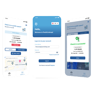
, from field research notes, July 202250% faster. Significantly more usable. Tested in the field.
Field research first, then redesign around what actually blocked people
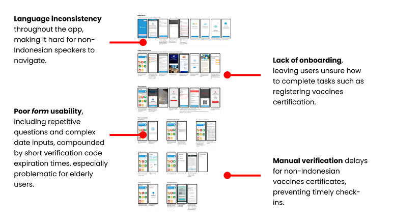
I started with field observation in 10 malls across Indonesia to see the problem directly. Then I conducted a UX audit of the original app to document the specific usability failures: language inconsistency throughout the interface, no onboarding for first-time users, poor form design with repetitive inputs and expiring verification codes, and a manual vaccine verification process that could take up to three days.
User interviews with foreign tourists and security staff confirmed the three biggest pain points: the language barrier, the slow vaccine verification, and a check-in process that was simply too cumbersome for someone unfamiliar with the app.
From there: persona, user journey, SCAMPER ideation, UX architecture, wireframes, a Figma prototype, and a field test with 10 participants. WCAG 2.1 compliance was checked throughout the design process, not added at the end.
Ten malls, one month, the same problem everywhere
In July 2022 I visited 10 different Indonesian malls to observe check-in behaviour in the field. I was not interviewing people at this stage. I was watching what happened at the entrance: who got through quickly, who got stuck, who needed help, and how security staff responded when the app failed.
Foreign tourists showed up as the clearest failure case every time. The pattern was consistent: download the app, hit a wall with the registration form in Indonesian, wait days for vaccine verification to be approved, get rejected at the entrance, and end up in a manual queue while a security guard tried to process them with a pen and paper.
Families with children made it worse. Every family member had to be registered individually. One couple with three kids spent over eight minutes at an entrance checkpoint before getting through.
Four usability failures in the original app
After the field observations I ran a structured UX audit of the existing Peduli Lindungi app. Four problems stood out as the most damaging for a foreign tourist specifically:
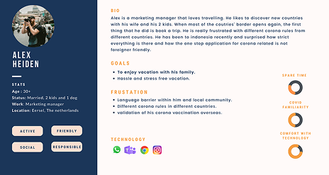
One persona, one complete journey through the check-in process
I conducted interviews with foreign tourists and security staff after the field observations to get qualitative context behind what I had seen. The interviews confirmed the three main pain points: language barriers, lengthy vaccine verification, and a check-in process that was too slow and too unpredictable.
From those interviews I built a persona and mapped the full user journey through the process, from downloading the app to completing a check-in at a venue. The journey mapping was not just about the happy path. I paid particular attention to the edge cases: check-in rejection, family members needing individual registration, vaccine certificate not yet approved. Those were the moments that caused the most frustration, and they were also the most common.
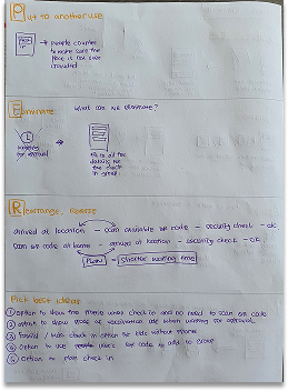
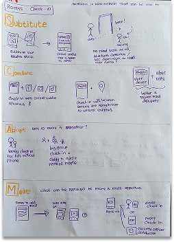
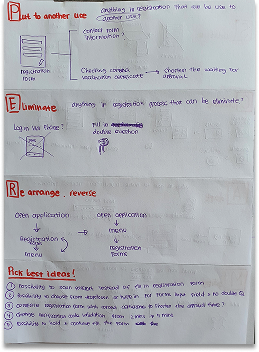
Using SCAMPER to find solutions that were not just "add English"
The obvious fix was localisation. Add English, done. But that would not solve the slow verification, the family registration problem, or the onboarding gap. I used the SCAMPER framework to push past the obvious and find structural improvements.
The four ideas that came out of it and made it into the prototype:
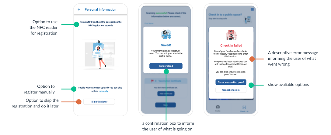
- Pre-check-in. Allow tourists to upload vaccination certificates before arriving at a venue. Once approved, the certificate is stored as reusable proof so they do not need to repeat the process at every location.
- Geofencing-based automatic check-in. When a user with an approved certificate approaches a public space, the app detects the location and checks them in automatically. No QR scan required.
- Family check-in. One person initiates check-in for the whole group. No more registering each family member individually at the entrance.
- Clear error states with recovery guidance. Every rejection or failure state in the app tells the user exactly what went wrong and what to do next, in plain English.
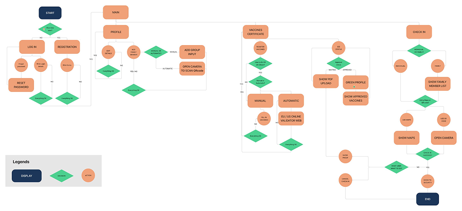
Mapping the full flow before drawing any screens
Before moving into wireframes, I mapped the complete user flow from app download to successful check-in, including all the branching paths: vaccine not yet approved, check-in rejected, family member not registered. This was important because the failure paths were where tourists got most stuck, and I wanted to design for those explicitly rather than discovering them late in prototyping.
The architecture also helped me validate that the pre-check-in and geofencing features did not create new complexity in the core flow. They needed to run in the background without adding steps for users who already had an approved certificate.
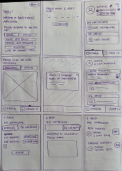
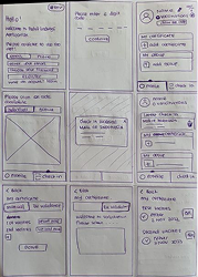
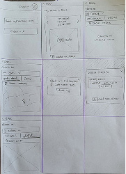
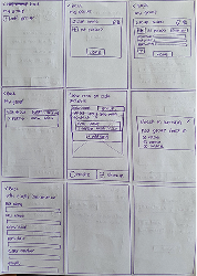
Low-fi wireframes, tested early, then high-fidelity in Figma
I started with low-fidelity wireframes based on the user flow. I tested these with a few people to check the layout and navigation logic before investing time in a high-fidelity prototype. Catching a navigation issue at sketch stage takes about five minutes to fix. At hi-fi stage, it takes considerably longer.
The Figma prototype used a minimalist design approach to keep the interface accessible to users who were not confident with apps. I kept the same colour scheme as the original Peduli Lindungi app to maintain familiarity, while redesigning the layout, language, and interaction patterns from the ground up. WCAG 2.1 compliance was checked throughout, not at the end.
Field test with 10 participants. Measurable improvement on every metric.
I ran a field test with 10 participants using the Figma prototype, then conducted follow-up interviews to gather qualitative feedback on what worked and what did not. The results held up across all three areas I had set out to improve.
The pre-check-in feature had the biggest single impact. Once a tourist had their certificate approved and stored, every subsequent check-in at any venue was near-instant. The multi-day approval wait became a one-time cost rather than a repeated barrier.
Where this project got uncomfortable
University projects about government products have a particular energy. You are critiquing something that real engineers built under real pressure, for a real crisis, with institutional constraints you know nothing about.
What designing for a mandatory-use app taught me
The thing that shifted most for me on this project was how I think about accessibility and language in design. Before it, I thought of English support as a feature you add for international users. After spending a month watching tourists get blocked at mall entrances by an app they could not read, I understood it differently. Language is access. When an app is mandatory for entry, a language barrier is not an inconvenience. It is a barrier to going about your daily life.
Designing in a government context also forced a kind of humility I had not fully developed yet. The original app was not poorly designed because the engineers did not care. It was built under crisis conditions, with competing institutional pressures, in a short timeframe. That context does not excuse the usability problems, but it does change how you approach the redesign. You are not just improving an interface. You are working within a system that exists for reasons that go beyond UX.
The limitation I would fix if I revisited this: only 10 participants in the field test, and none had diagnosed accessibility needs or were elderly. A stronger test would include those users specifically, since they faced the highest barriers in the original app.
Next case study
AI Fluency →